What's the worst mobile app experience?
We’ve covered Bolt and Lovable before.
And now another tool launched this week called Build which claims to have solved the one thing Bolt and Lovable haven’t: colors and consistency of your brand.
If this works as promised, this would be INSANELY good for PMs who want to iterate quickly.
So I tested it against Lovable and Bolt on the same two briefs.
Before we talk results, here’s a download of what happened in AI this week:
Mystery Box
I've been able to organise something cool!
First 100 readers who reply get it.
TOOLS THAT MADE ME PAUSE
Fuser connects 150+ AI models across text, image, video, audio, and 3D on one visual canvas. Build workflows by dragging and connecting nodes without needing to code or switch between apps. No GPU required, no subscriptions. Just credits for what you generate.
OpenBuilder uses optimized open-source models to match Claude Sonnet 4's performance, making building completely free. Built on VS Code so you can swap AI models, try different agents, or export your codebase anytime. Includes an interactive debugger, and if that doesn't work, you can escalate to a real developer who already has your project context.
The Hog gives one person the power of an entire sales and marketing team. AI co-pilots continuously monitor your market, identify opportunities, and generate actionable game plans to connect with potential customers. Maps your ICP, channels, and opportunities across platforms beyond LinkedIn and email, then stack-ranks what to do next based on your goals.
The Test
Two briefs designed to expose whether a tool understands constraints or just makes things pretty.
Test 1: Platform conventions matter
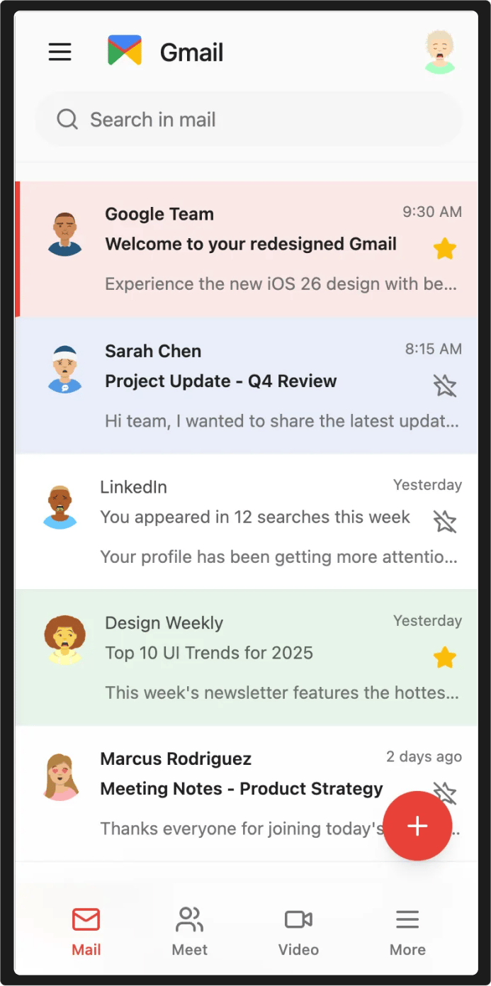
"I work at Google. Redesign the Gmail iOS mobile app and add the iOS 26 glass navbar to it."
This tests whether the tool understands iOS design language. The glass navbar isn't just aesthetic - it's a specific blur effect, specific spacing, specific interaction patterns that iOS 26 introduced.
Can the tool follow platform guidelines? Or will it just make a generic navbar and call it done?
Test 2: User flows matter
"I work at Skyscanner. Redesign the home screen to let users start planning a trip in one click."
This tests whether the tool understands user friction. Skyscanner's current flow makes you fill out forms before you can explore. The brief explicitly asks for one-click planning.
Can the tool simplify the flow? Or will it just reskin the existing multi-step process?
Same structure. Three tools.
Let's see who actually solves the problem.
Prompt 1: Gmail
Reforge Build
The only version that tried to speak iOS 26.
The blur, the navbar, the tappable elements - it felt like an experiment in motion rather than a static mock-up.
Also I thought brand colors? What happened to the colors in the bottom nav bar?
Lovable
Nice styling. Crisp cards.
But the navbar concept? Weak. Played safe.
Bolt
Pleasant but missed the brief.
Minimal Gmail redesign without the iOS 26 glass navbar.
If the task was clarity, all passed.
If the task was "iOS 26 glass navbar," only one tried seriously.
Prompt 2: Skyscanner
Reforge Build
Auto-detects location.
Big "Plan a trip" call-to-action. One tap. Instructions minimized.
This solved the problem.
And spot on with colors this time.

Lovable
Visually clean.
But flows stayed old. Two-step search, usual structure.
Bolt
Explored a "menu" style. Inspire me. Explore deals.
Beautiful but not one-click planning.
All three looked good. Only one solved the problem as asked.
What It Means
Different tools optimize for different things.
Lovable and Bolt produced more polished, professional-looking designs. Better for stakeholder presentations or portfolio work.
Build followed the specific constraints in the brief: iOS 26 conventions, one-click flow, but the execution was less refined.
Whether that matters depends on what you need.
If you're exploring visual directions, the polish matters.
If you're prototyping a flow change, the constraint-following matters.
Small test. Six designs.
Each tool has different strengths.
Which one would you choose?
If you read till here, you might find this interesting
#AD 1
An AI scheduling assistant that lives up to the hype.
Skej is an AI scheduling assistant that works just like a human. You can CC Skej on any email, and watch it book all your meetings. It also handles scheduling, rescheduling, and event reminders.
Imagine life with a 24/7 assistant who responds so naturally, you’ll forget it’s AI.
Smart Scheduling
Skej handles time zones and can scan booking linksCustomizable
Create assistants with their own names and personalities.Flexible
Connect to multiple calendars and email addresses.Works Everywhere
Write to Skej on email, text, WhatsApp, and Slack.
Whether you’re scheduling a quick team call or coordinating a sales pitch across the globe, Skej gets it done fast and effortlessly. You’ll never want to schedule a meeting yourself, ever again.
The best part? You can try Skej for free right now.
#AD 2
Shoppers are adding to cart for the holidays
Over the next year, Roku predicts that 100% of the streaming audience will see ads. For growth marketers in 2026, CTV will remain an important “safe space” as AI creates widespread disruption in the search and social channels. Plus, easier access to self-serve CTV ad buying tools and targeting options will lead to a surge in locally-targeted streaming campaigns.
Read our guide to find out why growth marketers should make sure CTV is part of their 2026 media mix.


